General
Guides
Development
API
Charts
- Bar Chart
- Bar Chart (Discrete)
- Donut Chart
- Scatter Plot
- Simple Time Series
- Singlegraph
- Singlegraph Grid
- Standard Time Series
Text
- Comparison Jumbotron Singlestat
- Comparison Singlestat
- Comparison Summation Table
- Heading
- Jumbotron Singlestat
- Markdown
- Percentage Table
- Singlestat
- Summation Table
- Timer Stat
- Time-Shifted Jumbotron Singlestat
- Time-Shifted Singlestat
- Time-Shifted Summation Table
Layout
Tutorial
This tutorial introduces the editing user interface by walking through creating the simplest possible dashboard - one with a single query for random data, and two visualizations.
Create a blank dashboard
Once you’ve got Tessera running, launch a browser and load up the front page. If you’re running with the default config from source, it will be at localhost:5000.
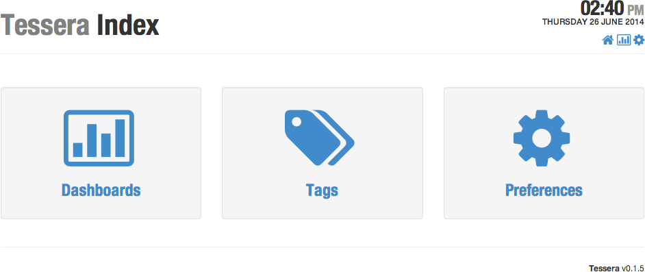
Click on the Dashboards icon to go to the dashboard listing page, which is where you can create a new dashboard from.
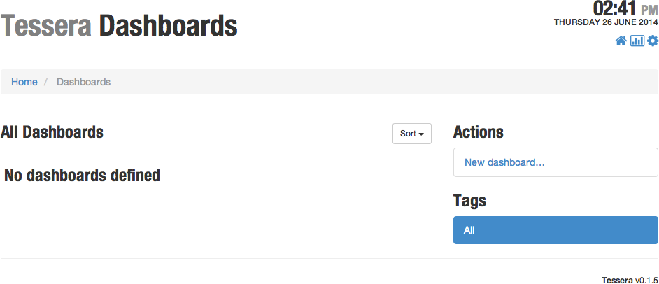
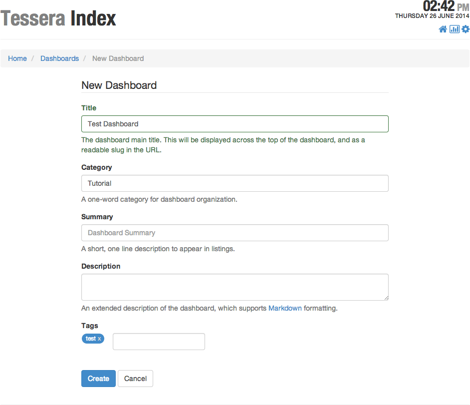
Click on New dashboard…, then fill in some data in the form. The only required field is the title.
Open the Editor
From the blank new dashboard that results, click on the Edit button in the main toolbar.
![]()
Create a Data Query
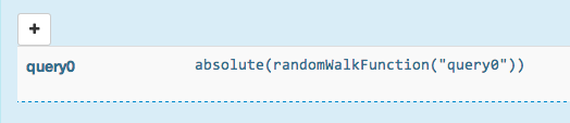
Before laying out any elements, we need a data query. In the metadata panel that opened when you entered edit mode, click on the Queries tab, then click the + button to add a new query.
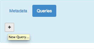
That will create a new query with a placeholder Graphite expression to generate some random data.
Create the Initial Layout
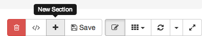
In order to add anything to the dashboard, you have to start with a section at the top level. Click the + button in the main toolbar to add a new section.
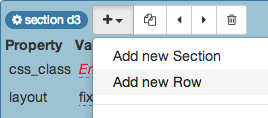
In edit mode, all items have a shaded title bar, with a badge in the upper left corner indicating the item’s type and ID. Clicking on the badge will open a property sheet allowing you to edit that item.

After opening the property sheet for the section, add a new row to the section by clicking the Add button (labeled +) and selecting Add new Row from the menu.
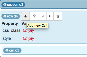
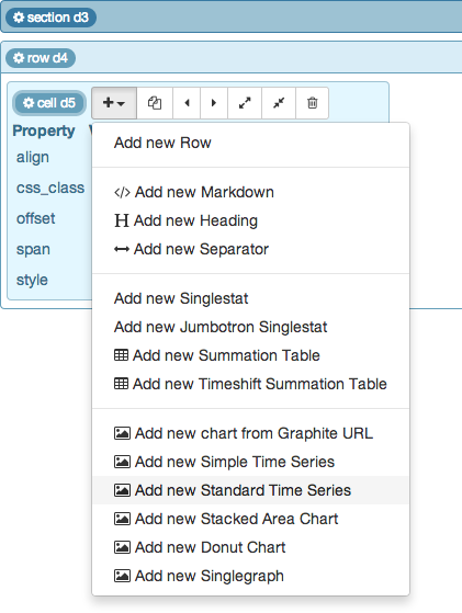
The only items that you can add to rows are cells, which control the placement and width of presentations. Click on the + button to add a new cell to the row.
Next, add a Standard Time Series chart to the cell. Click on the cell header badge to open the property sheet, then click on the + button and select Add new Standard Time Series from the menu.
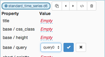
Open the property sheet for the new time series, and set the value of the query property. Click on the Empty placeholder value and select query0 from the popup menu. Confirm the choice by either clicking the checkmark button or pressing Enter on the keyboard.
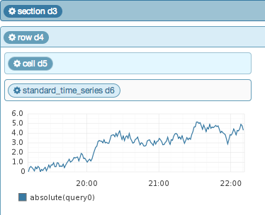
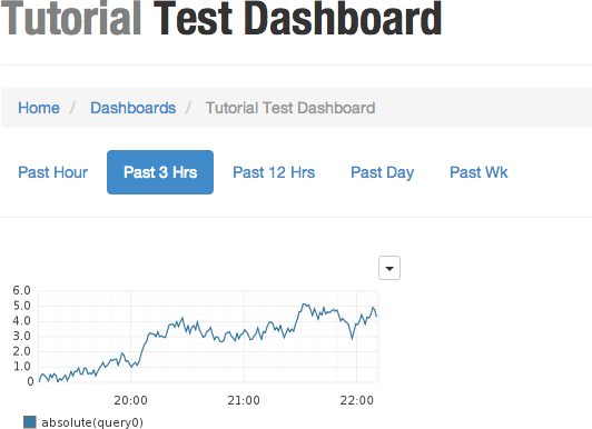
Once you’ve set the query, the time series chart will immediately render.
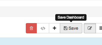
At this point it would be a good idea to save the edits - go back up to the main toolbar and click the Save button. Alternatively, you can save instantly with the ctrl-shift-s keyboard shortcut.
Exit edit mode by click on the edit button again, or with the ctrl-shift-e keyboard shortcut.
Congratulations, it’s a dashboard!